Tuesday, 15 October 2013

Sunday, 6 October 2013
8.channel logo analysis
E4 logo:
 This is the e4 logo there colour scheme is purple. this colour stand out to theirs its not to feminine and not to masculine, they have always used this colour. they have also combined the 'e' into the '4' this gives the logo more imaginative look, makes it more exciting for the viewers. I feel this logo is designed well as you can clearly see what it is and also catches your attention.
Target audience: i feel that this logo is aimed at a target audience of 12-28 year old. i have come to this conclusion due to the colour E4 have chosen and also the rounded shape can be a younger target audience however the sharpness of the 'E' is more aimed at a older age.
Channel 4 logo:
The channel 4 logo doesn't have a colour scheme, other the years they have changed the colour of their logo. however the way the different shapes form the number '4' makes this logo very different.its confusing but very clever. also this logo stands out you can clearly see what it is.
Target audience: I have decided that the target audience is aimed at a more older generation. people from around 25-40 years of age i have chosen this target audience as there isn't a colour scheme and the shapes used can be quiet interesting.
BBC One logo:
The BBC One logo normally has a red background and a white font. this is a very good and clever technique the red is bright and vibrant. it stands put. the white however also is very clear on a red surface. the 'bbc' Is in blocks this makes it stand out more. the 'one' is also larger than the 'bbc' but isn't in blocks. this is clever because as it is bigger you see it more. but a the 'bbc' is In blocks it catches the attention of the viewer more.
Target Audience: Having looked at BBC 1 logo i have decided that there logo is aimed at a older age group this is due to the fact in font choice and how it is positioned in the middle of a square red background.
ITV logo:
 The ITV logo can have different colour schemes depending on the channel. however their main logo has various different colours. It had a bright vibrant blue that grabs the viewers attention, then the lighter blue draws the viewer across. the black give the logo more of a definition. i find it interesting how it is all lower case, however if it was in capitals then it couldn't be joined up as easy.
Target Audience: i feel that this ITV logo is aimed at all ages, the colours can catch the attention of older people and younger. also the way the font has been chosen will connect with a younger generation as it is lowercase and joined together.
SKY 1 logo:
 The SKY 1 logo has a very simple layout. You can clearly see the logo on the left hand side and then the vibrant blue behind the one stands out the most. this is in the middle of the logo and then the viewer rears off to the left which will then be easily noticed as SKY 1.
Target Audience: I feel that this target audience is aimed at higher age. this is due to the colours that are chosen and also the format in which this logo is laid out. it is very bold and clear however there are simple shapes.
Target audience: i feel that this logo is aimed at a target audience of 12-28 year old. i have come to this conclusion due to the colour E4 have chosen and also the rounded shape can be a younger target audience however the sharpness of the 'E' is more aimed at a older age.
Channel 4 logo:

The channel 4 logo doesn't have a colour scheme, other the years they have changed the colour of their logo. however the way the different shapes form the number '4' makes this logo very different.its confusing but very clever. also this logo stands out you can clearly see what it is.
Target audience: I have decided that the target audience is aimed at a more older generation. people from around 25-40 years of age i have chosen this target audience as there isn't a colour scheme and the shapes used can be quiet interesting.
BBC One logo:

The BBC One logo normally has a red background and a white font. this is a very good and clever technique the red is bright and vibrant. it stands put. the white however also is very clear on a red surface. the 'bbc' Is in blocks this makes it stand out more. the 'one' is also larger than the 'bbc' but isn't in blocks. this is clever because as it is bigger you see it more. but a the 'bbc' is In blocks it catches the attention of the viewer more.
Target Audience: Having looked at BBC 1 logo i have decided that there logo is aimed at a older age group this is due to the fact in font choice and how it is positioned in the middle of a square red background.
ITV logo:
Target Audience: i feel that this ITV logo is aimed at all ages, the colours can catch the attention of older people and younger. also the way the font has been chosen will connect with a younger generation as it is lowercase and joined together.
SKY 1 logo:
Target Audience: I feel that this target audience is aimed at higher age. this is due to the colours that are chosen and also the format in which this logo is laid out. it is very bold and clear however there are simple shapes.
Thursday, 3 October 2013
final Logo Justification.

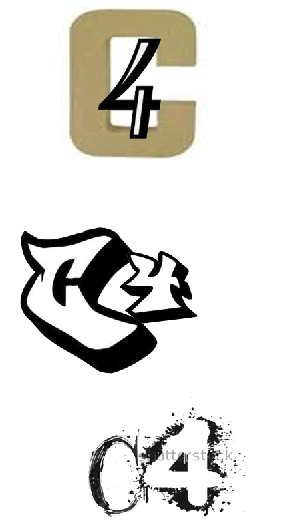
i have chosen this logo to to be my final desgin for channel 4. i have chosen this to be my logo as i feel it is different and stands out to the viewers. this logo is mainly aimed at the younger generation. the style in which i have designed is more cartton like. catching the attention of children. i have added colour to my logo to make the 'c' and '4' bolder and stand out. also the colour in the background make the whole logo stand out. the what my logo is layed out gives the 'kiddy' impression. the way that the 'splat' is placed behind the main structure of the logo also gives the expression of a child painting.
Wednesday, 2 October 2013
Monday, 30 September 2013
9. Typography
 this font style is called kids written font.
why chosen. i have chosen this font as i feel it looks as though a 'kid' has written it.

why chosen: i have chosen this font because it looks up to date and very modern.

font name: cloister black.
why chosen: I feel this robot is old with the flicks and historic writing.

font style: one Direction
Why Chosen: I have chosen this font as it looks as though it has been done with a paintbrush. Thick, bold and hand written.

Font Style. exmouth.
why chosen: I have chosen this font as I fell it has a flow to it. It is upper class font showing the 'fashion' is high and expensive.
 font style: Fabrics
Why chosen: I have chosen this font style as I feel it is different to others. it has the 'comedy' element. which its the lines going round the letters representing the stitching.
font style: nothing to loose.
 Why chosen: I have chosen this font as it is scary, meaning there's a lot of drama behind it. either being in a film or real life this font means lots of 'drama' has happened (bad things).

why chosen. i have chosen this font as i feel it fits this word best. it is thick and both with different flicks. making it aimed more at upper class people.
 Font style: Most wasted
Why chosen. i have chosen this style as it is graffiti like. it isn't bubble. however this style is how teenage people graffiti. it fits in with there age and how they act.

Font style. Lobster.
why chosen. i have chosen this font due to they way it is. it hasn't got any footballs or sport objects, however i feel it fits the was sport genre. it is written the same as a sports poster or they was written in a newpaper.
My Top 3 NME Music Videos
My Top Three Music Videos. NME.

Lady GaGa- Telephone. 17
This video was 9mins 31 seconds. This video had a small story had to it. there was many different camera filming to get the effect of the dancing and capture the different types of clothes and brands they was wearing. This video also had different photos of lady gaga with different costumes. this video is a main sex appeal for young middle ages people.

Fit But You Know it - 30
fit but you know it is a music video with a small story to it. it it recorded with low quality cameras, it is amunst the streets. it also has pictures that are played so it looks as though it is moving. this song is mainly rap. this song is for middle aged teenagers that look and watch what people do in everyday life.

The Scientist - Coldplay. 66.
This song is based on a story of a car crash. there's the main driver and two of her friends. the car crashes, then another crashes into them. the driver survives but her friends die. The song is played over the to of what is happening giving the mood and lyrics for what chaos has happened in the video. I feel this is a sad and upsetting video o as it can happen anywhere to anyone giving people a message.
Subscribe to:
Posts (Atom)